
Overview
The element palette contains the building blocks (form elements) used to collect data within your form. We recommend you familiarize yourself with this information, as it will help you in determining what data to collect and how best to collect it.
The tables on this page include the name of the element, an example of the element when added to a page, its purpose and usage, and the properties that can be configured for the element. For detailed information about properties, refer to Element Properties.
To access the Element Palette:
-
On the main menu, select Configuration, then Form Builder.
-
Select the form you want to work with.
-
Select the Form tab.
-
Click Elements.
Structural Elements
All additional form elements must be contained in a group and a section. For a video overview of the structure of a form, refer to Form Builder- Form Structure.
|
Element |
Example |
Purpose |
Properties |
|---|---|---|---|
|
Section |
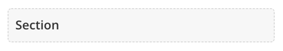
|
Use to define groupings of content. All Groups must be contained within Sections. |
Visibility |
|
Group |
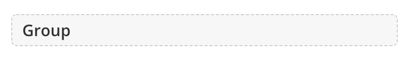
|
Use to group related elements. All Groups must be contained within Sections. All non-hidden fields must be contained within Groups. |
Visibility |
Content Elements
|
Element |
Example |
Purpose |
Properties |
|---|---|---|---|
|
Heading |

|
Use to preface a section. Note: Headings that are the first item on the page (when they’re not in a Section or a Group) are h1. Headings that are within Sections are h2. Headings that are within Groups are h3. |
|
|
Paragraph |

|
Use the rich-text editor to quickly and easily enter and format the content you want to appear, including adding links, images, tables, tokens, etc. |
|
Basic Elements
|
Element |
Example |
Purpose |
Properties |
|---|---|---|---|
|
Checkbox |

|
Use for input fields where users can select a value to indicate true/false, yes/no, etc.
|
|
|
Dropdown |
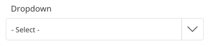
|
Use for input fields where users can select one value from a list. This element type supports Typeahead behavior and functionality. |
|
|
File Upload |

|
Use for input fields where users can upload a file. Upon publishing the form, you will need to assign permissions through a permission profile for the document so that administrative users can interact with the document field. |
|
|
Radio |
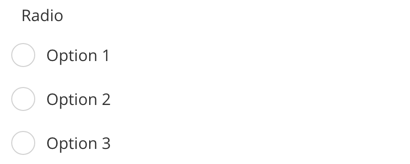
|
Use for input fields where users can select one value from a limited number of choices. Once a user selects a value, they can switch between values; however, they cannot fully deselect an option.
|
|
|
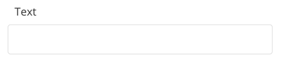
Text |
|
Use for input fields where users can enter one line of text. |
|
|
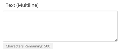
Text (Multiline) |
|
Use for input fields where users can enter multiple lines of text. |
|
Special Elements
|
Element |
Example |
Purpose |
Properties |
|---|---|---|---|
|
Address Validation |

|
Use to validate address fields. The use of the following address structure is required:
Address structures that collect address components in a more piecemeal fashion (for example, street pre-direction, street number, street name, street suffix, street post-direction, etc.) are not supported. Addresses within countries that do not have a state or province value are not supported. |
|
|
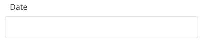
Date |
|
Use for input fields where users can enter a date. |
|
|
|
|
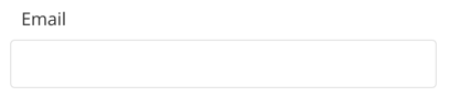
Use for input fields where users can enter an email address. |
|
|
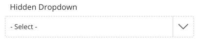
Hidden Dropdown |
|
Use for input fields where internal users can select one value from a list. This is used to store pre-populated data on a form that is not intended for parent consumption, such as Enroll Status – New/Returning. |
|
|
Hidden File Upload |

|
Use for input fields where admin users can upload a file. Upon publishing the form, you will need to assign permissions through a permission profile for the document so that administrative users can interact with the document field. |
|
|
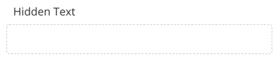
Hidden Text |
|
Use for input fields where internal users can enter one line of text. This is used to store pre-populated data on a form that is not intended for parent consumption, such as ID. |
|
|
Image Upload |

|
Use for input fields where users can upload an image. Uploading images is different than uploading files. An uploaded image displays as a thumbnail on the form and is rendered online within the submission record. |
|
|
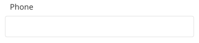
Phone |
|
Use for input fields where users can enter a phone number. This field requires that the phone number be entered using xxx-xxx-xxxx format. |
|
|
Remove/Restore Contact |

|
Use for scenarios where users should be required to maintain the relationship between a contact’s ID and the rest of their data. |
|

|
Use to return a value for the student's zoned school based on the grade and address entered by the parent. |
Refer to School Locator Properties. |